Before we move on to Dynamic Dashboard will learn how to
create speedometer chart.
To add the chart on our excel we need below data on our sheet!
Speedometer category:
Bad
Average
Good
Excellent
NamesRange
Needle 45%
Needle Size 1%
Blank Area 154%
Now create a SPEEDOMETER in Excel,use the below steps:
1. Go to Insert Tab ➡ Charts ➡ Doughnut Chart (you will get a blank chart area)
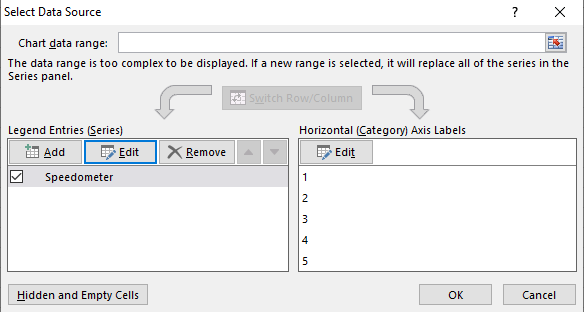
2. Right click on the blank chart and then click on Select Data.
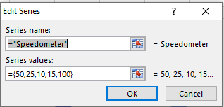
3. New window will popup and under that window click Add button and then under series name type any name " we added speedometer", under series range type ={50,25,10,15,100} and hit ok as shown in image below:
Once you done you popup box should look like below and then hit okay.
Once you click okay, your doughnut chart will like below (After deleting label)
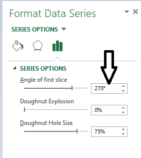
4. Now change the angle of the chart and for that right click on the chart and then click on Format Data Series ➡ type 270° under “Angle of first slice” and change the Doughnut hole size to 60% then hit enter
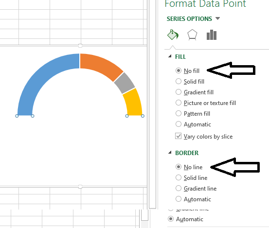
5. Click on the below part of chart which is not required and click on fill option click "No Fill", do the same for border.
6. Repeat the same for rest of the area and select solid colour and use the same for border we have used the colour as below you can any of your choice:
7. Now it's time to create needle for you meter and do add that will add pie chart on same chart area by right click on chart and click select data.
Under popup window click on "Add button" ➡ Under series name type "Needle" and under range select the range from Sheet then hit okay.
Your chart should look like this:
8. Now it's time to merge the charts, to do so ➡ Design Tabs ➡ Change Chart Type. Under new pop window click combo ➡ select Doughnut for Speedometer and Pie for Needle then hit okay
9. Now again select the pie chart right click on it ➡ format data series and unfill the major part of chart and keep the smallest part by filling it color as black.
Note: If after selecting a pie chart if the angle is not correct make sure to change it to 270* for both the charts.
10. At this movment your chart should look like below:
11. Now it's time to add label and to do that Right Click ➜ Add Data Labels ➜ Add Data Labels ➡ select the data labels ➡ Format Data Label and after that click on Values from Cells then label from the first sheet and untick Values.
Once It's done your speedometer is ready you can watch our tutorial video for details - Click Here ▶


No comments:
Post a Comment